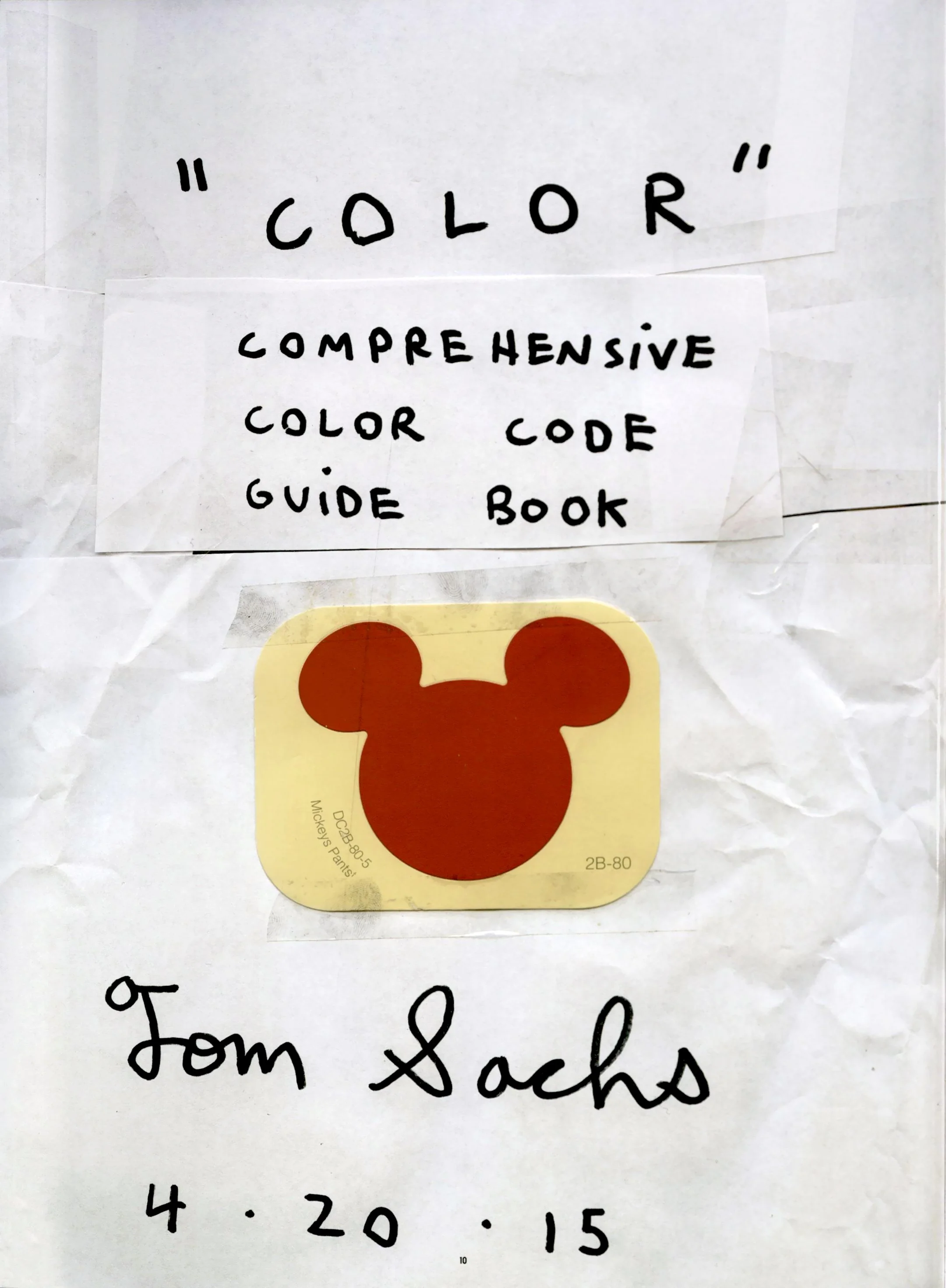
Tom Sachs publishes his “color code guidebook” in Frank Ocean’s magazine

“Color,” Boys Don’t Cry, pp. 10–11.
In his magazine, Boys Don’t Cry, Frank Ocean commissioned artist Tom Sachs to create a “comprehensive color code guidebook” that outlines the acceptable (and forbidden) paints and hues used in his NYC studio, as well as their applications in the products around us. Alongside its release, Sachs explained the origin of the piece in an interview with Pitchfork, saying:
This is the print version of my 2011 film Color. Frank and I are both very interested in cars and, of course, in color. Color affects the visual perception of form. Color is taste, and it is biased. If you dig just below the surface, you can’t talk about Porsche without talking about how the color of someone’s skin affects the spectrum of access they have.
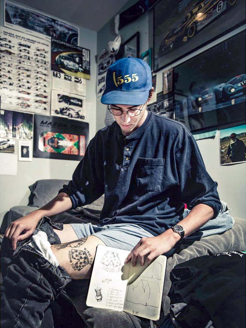
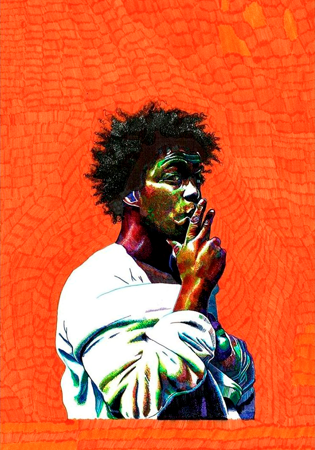
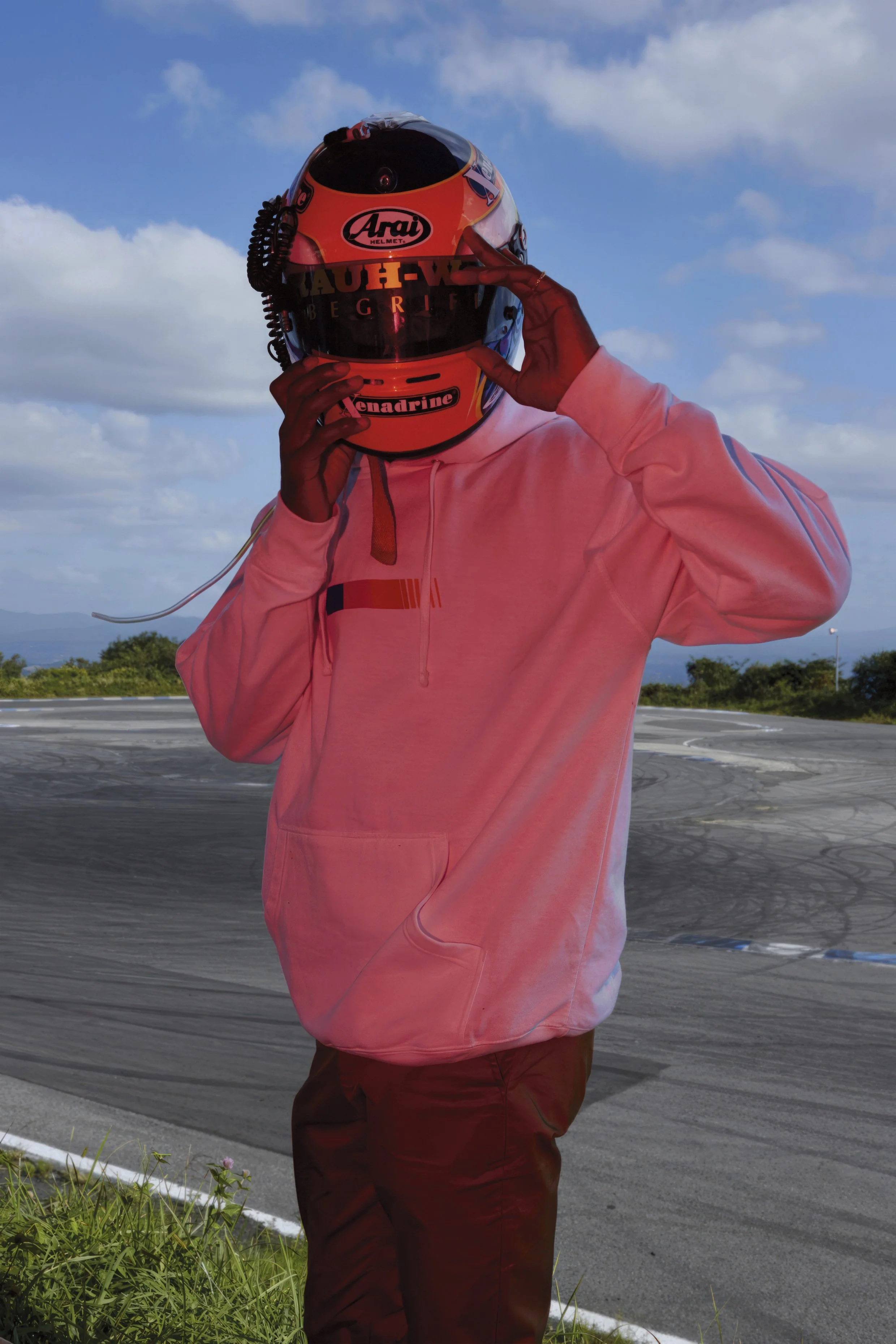
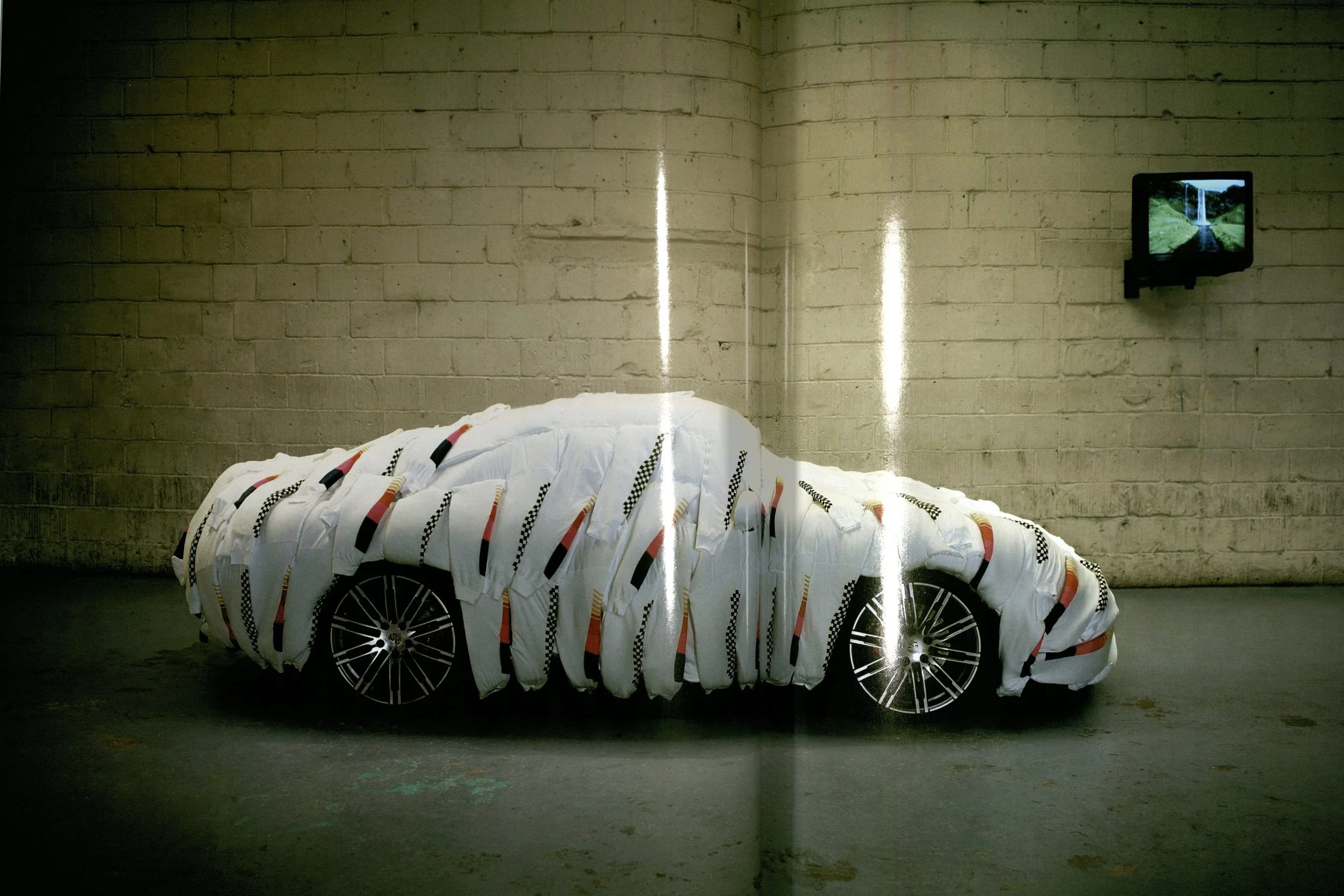
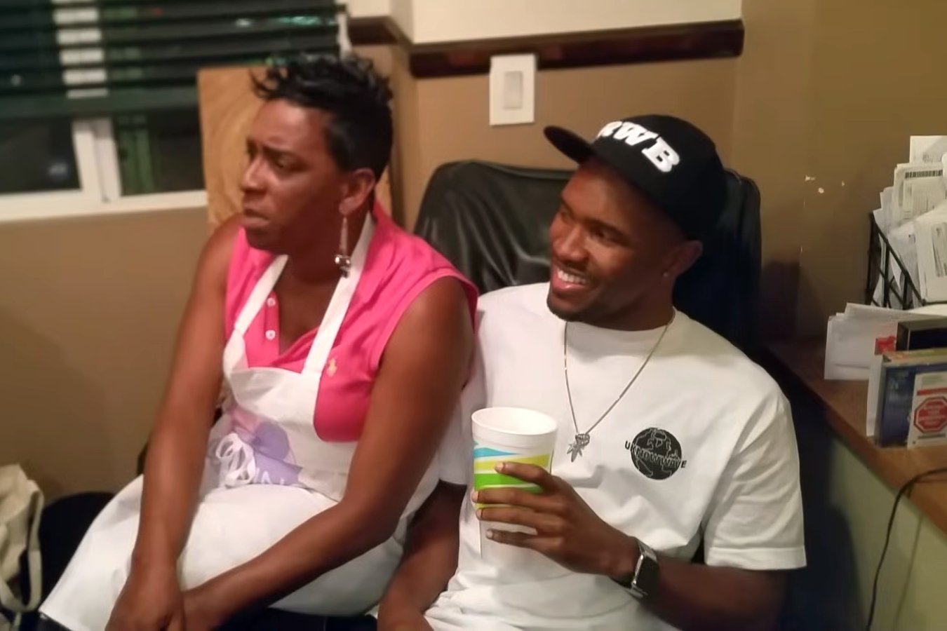
Across 18 pages, the magazine article uses a collage of scenes and quotes by Sachs and his collaborator, Van Neistat, lifted from the original 2011 video.
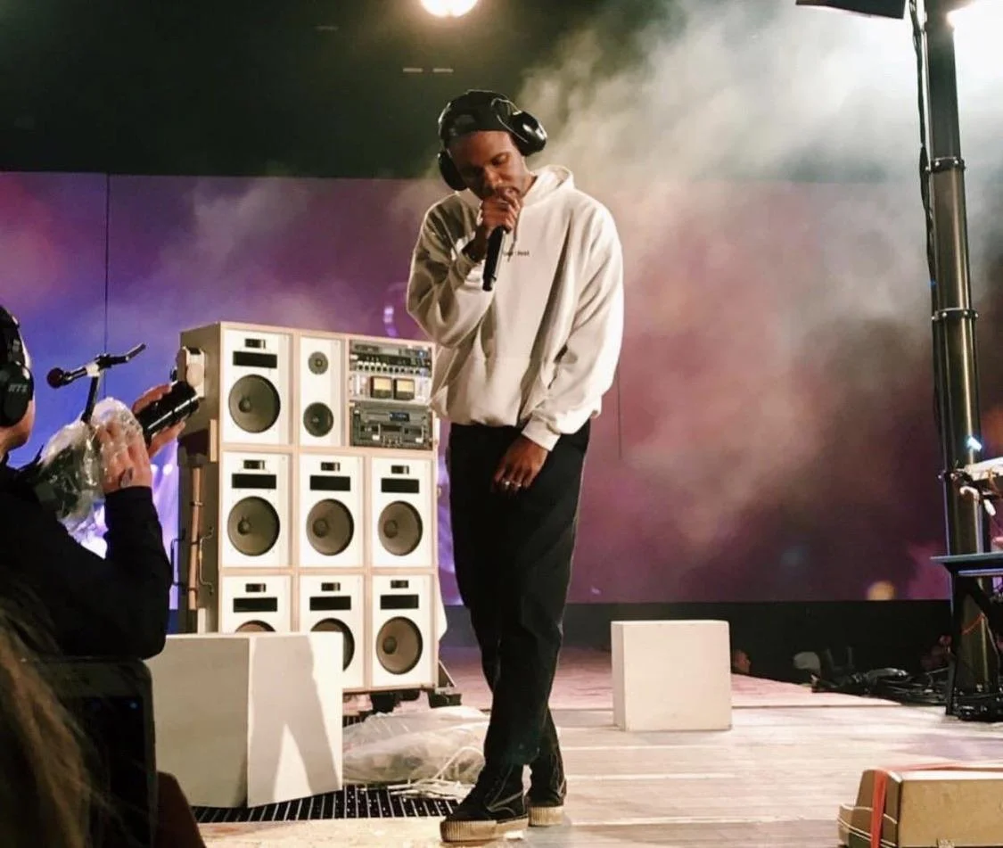
In addition to Boys Don’t Cry, Sachs also helped Ocean with his 2016 visual album Endless, lending him the massive boombox seen in the film. Sachs originally built the sound system, dubbed “Toyan’s Arsenal,” back in 2002.
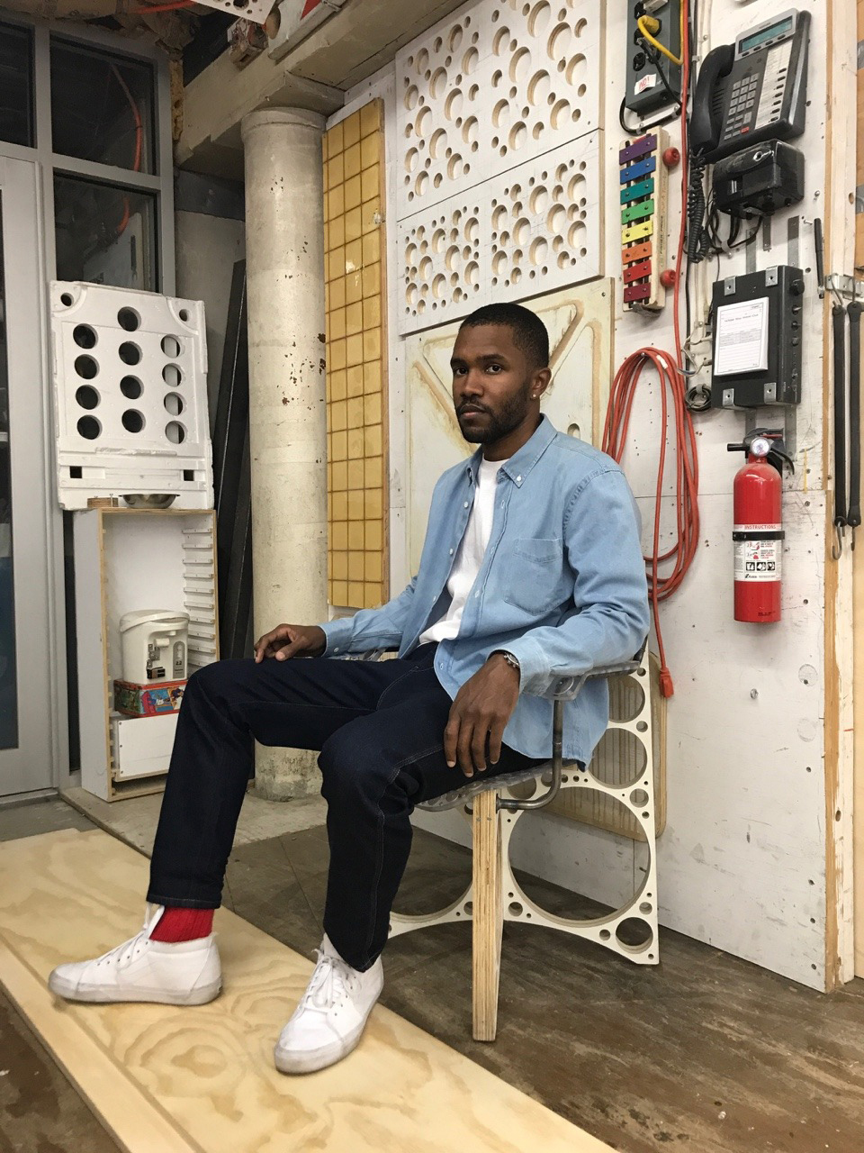
Magazine scans, behind-the-scenes photos, a transcript of the guidebook, and the film it’s based on are all available below. For more by Tom Sachs, follow him on YouTube, Vimeo, Instagram, Twitter, or Facebook, and check out his online store and furniture shop.
Scans:
Select a photo to view it fullscreen.
Note: The crumpled paper, fingerprints, tape, and similar details are part of the printed artwork, not external blemishes.


Photography:


Behind the Scenes:

Video:
Transcript:
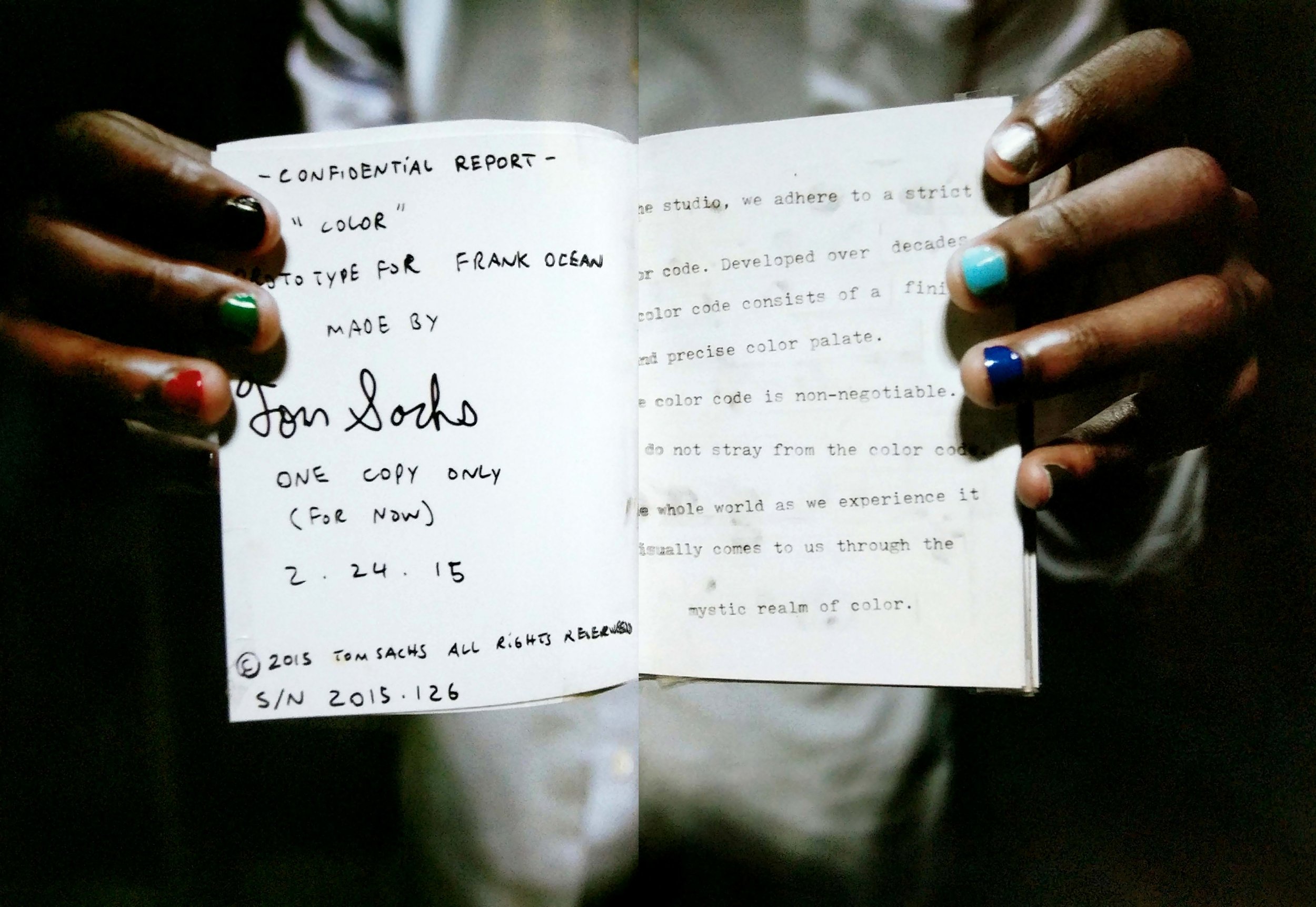
Confidential Report.
“Color” prototype for Frank Ocean made by Tom Sachs.
One copy only (for now).
2.24.15.
© 2015 Tom Sachs, All Rights Reserved.
S/N 2015.126.“Color”
Comprehensive Color Code Guide Book.
[DC2B-80-5 Mickeys Pants.]
Tom Sachs.
4.20.15.In the studio, we adhere to a strict color code. Developed over decades, our color code consists of a finite and precise color palette. The color code is non-negotiable. We do not stray from the color code. The whole world as we experience it visually comes to us through the mystic realm of color.
Green.
In the studio, green is olive drab. OD 7 is our olive drab.
For OD 7, our preferred choice is Krylon Industrial Camouflage 8143 Olive Drab. However, this has been discontinued.
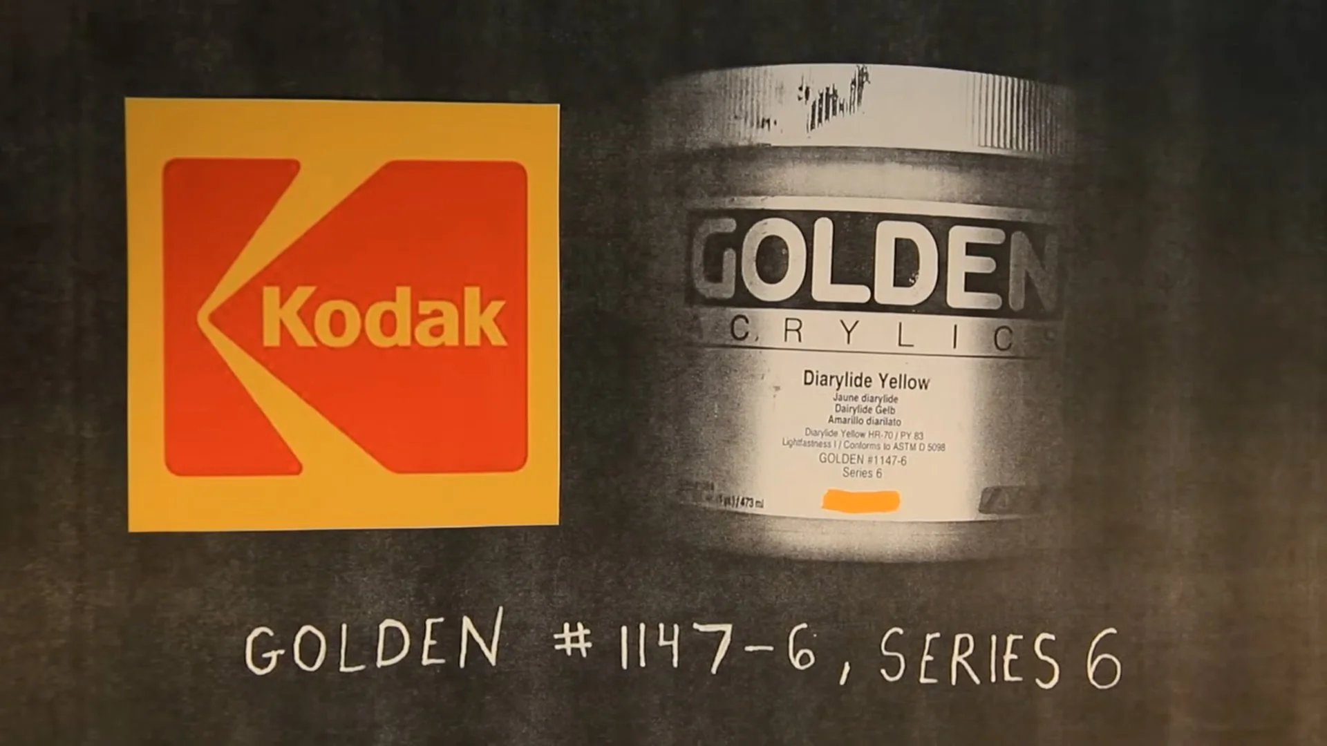
The search continues.Yellow.
McDonald’s Yellow: Golden Acrylics, C.P. Cadmium Yellow Medium; Golden #1130-6, Series 7.
Kodak Yellow: Golden Acrylics, Diarylide Yellow; Golden #1147-6, Series 6.Red.
Benjamin Moore Impervex Latex High Gloss Metal & Wood Enamel, Brilliant Red 309 20 (McDonald’s Red); or Krylon Industrial, 2108 Banner Safety Red.White.
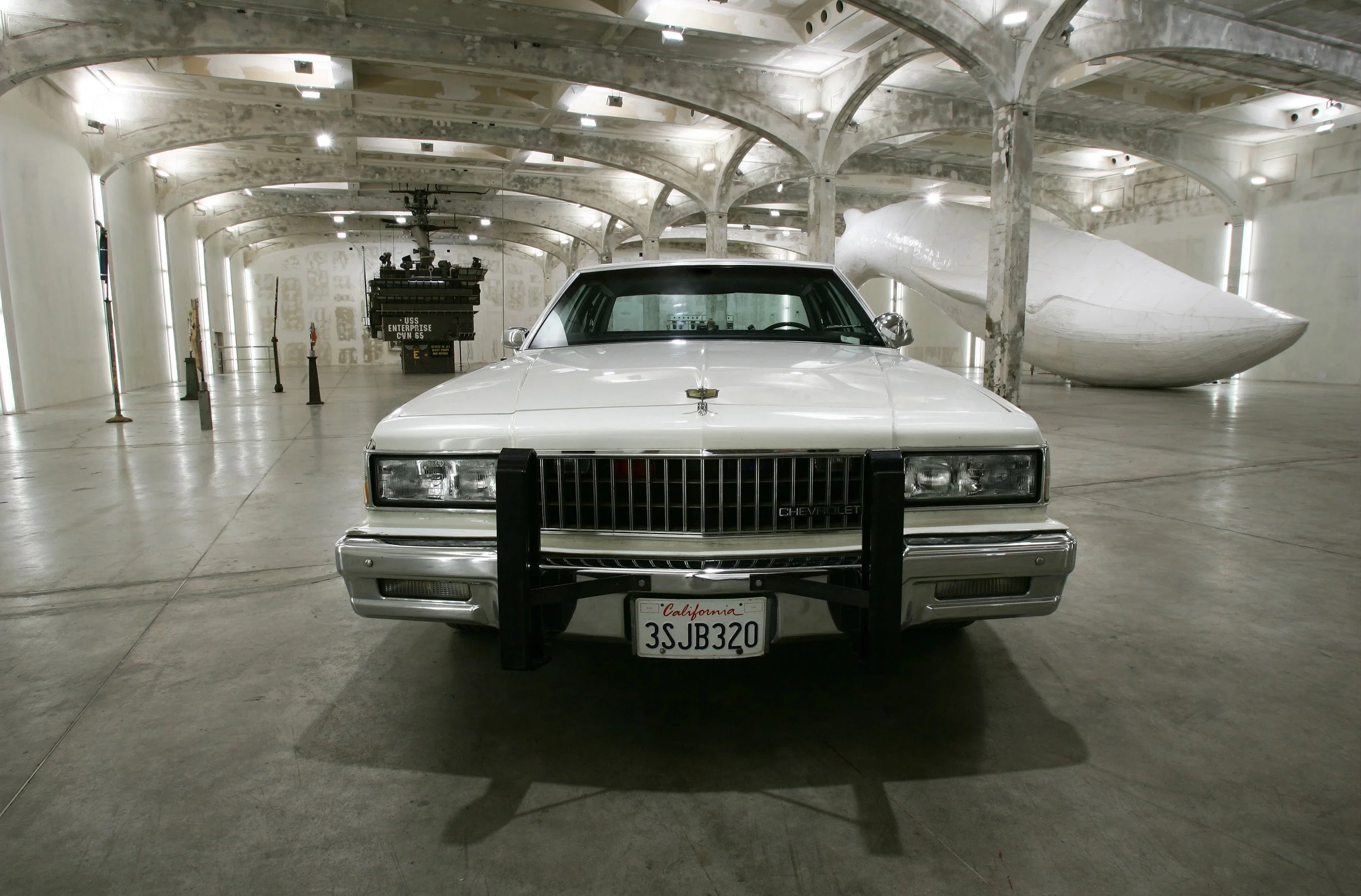
Benjamin Moore Decorators White, Flat Finish N215 04.
Alternatively: native whites i.e. 1989 Chevrolet Police Package White, or Hunt ® Foamcore White. Chevrolet Caprice, Balaenoptera musculus, “Tom Sachs,” Fondazione Prada, Milan, Italy, 6 April–15 June 2006.Black.
Flat: Benjamin Moore Regal Classic Premium Interior Paint, Black N215 80 Flat Acrylic.
Gloss: Benjamin Moore Impervex Latex High Gloss Metal & Wood Enamel, Black 30980.Orange.
Orange is a native color in the studio. You will not find orange paint here. Except for emergency situations. [Hermès Orange.]Purple.
The color purple is a forbidden color. The color purple is forbidden in the studio. The color purple is punishable by death. There is never an excuse for the color purple.Blue.
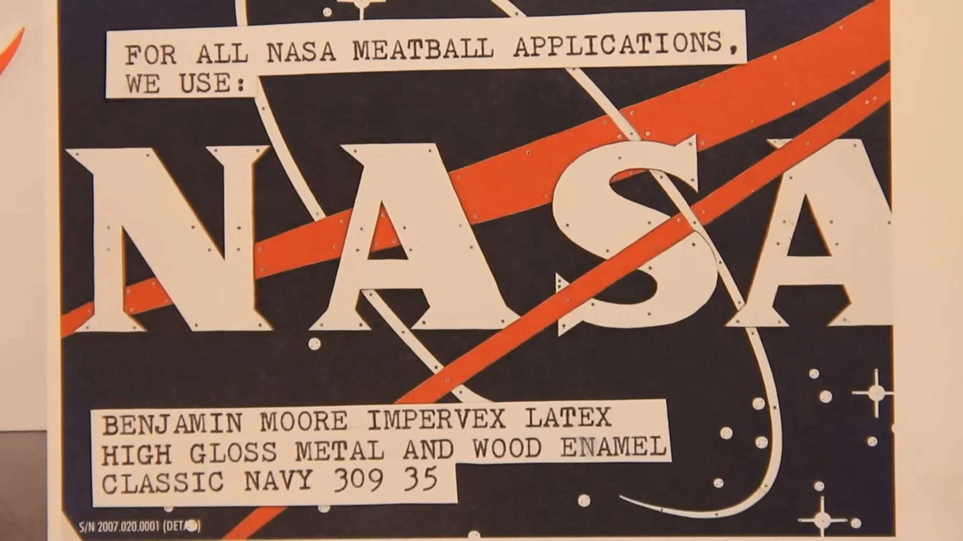
For all NASA meatball applications, we use:
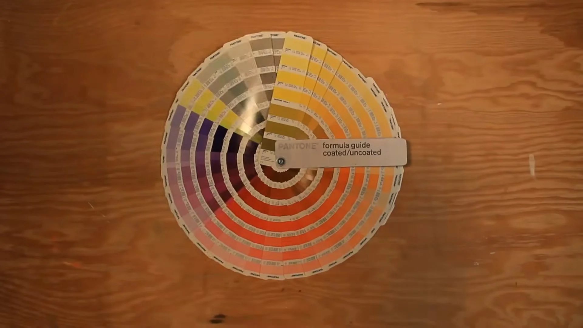
Benjamin Moore Impervex Latex High Gloss Metal & Wood Enamel, Classic Navy 309 35.Pantone color standards are generally to be avoided because their limited range discourages subtlety. While we admire Pantone’s packaging and judicious use of Helvetica, we resent choosing from their limited offerings. Secret societies conspire to keep us in the dark ages of color. Committee mentally guarantees that shitty cars like Saturn are only available in teal and maroon. In this studio, we shun decision by committee. Instead, we look to the superlative Porsche palette, which remains beautiful despite the company’s Nazi heritage and douchebag clientele.
Tom Sachs and Van Neistat. NYC 2012.Gulf Porsche Blue. [Porsche 917K Gulf #21.]
Counterfitter’s holy grail: Nike color swatch book SP/SU 2012.
“I’ve been 40 years discovering that the queen of all colors was black.” —Pierre-Auguste Renoir.
Related Articles: